|
Nobodies
|
Starting Process |
Sketches
|
|
At the beginning of this project, I was unsure of how to go through it. I had too many ideas of the styles that I want to use. Lithograph, or a digital illustration were two of the ones that I wanted to use in this project, but I didn’t know if I should chose a theme based around isolation or depression. These topics really inspired me to create a lot of pieces, the only problem was to know how to portray it.
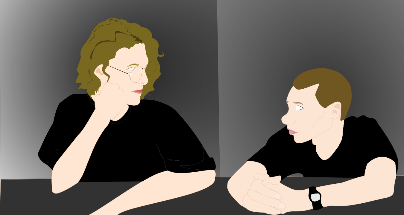
For this I came up with several sketches. 1. The first sketch consisted of two eyes that seem to not have any iris. The look came out to be malignant. I decided to draw this because I wanted to depict the look that depression can give its victim. 2. For this I drew a someone close to death. Their bones and facial expression show their death. I wanted to demonstrate how this mental illness can make someone a living zombie, one is slowly dying, but they keep living. 3. In the last one, I drew Dylan Klebold and Eric Harris. These two were the perpetrators in the Columbine massacre. Although they did this horrendous thing and I do not condone what they did, both were humans too. This one stood out to me the most because the media portrays them as monsters, when in reality they were only kids who wanted to be accepted and heard. They faced bullying, specially Eric, but suddenly they snapped and the shooting happened. At the end I chose the last sketch. |
|
Artist Inspiration
|
This piece was inspired by british multimedia artist, D*face. His prints were taken into consideration in order to create my piece. He is a semi-known artist that has done album cover work for Blink-182 as well as collaborating with an album cover for Christina Aguilera. Many of his pieces are created based on famous Pop Art artist, Roy Lichtenstein. However, he was inspired by Shepard Fairey's "Obey Giant" campaign. D*face began with only drawing to pass time, however, he began to create many pieces that eventually led him to his new job as an official artist that everybody knows.
|
|
Process Cont.
|
The first thing I did in the beginning of the creation of the piece was to scan my sketch and open it up in Inkscape. After this I began to add a layer for the face shape. When this was set, I then proceeded to tracing the face with the pen tool. The face shape was done, so I selected another tool that smoothed out the lines in order to create a softer lines and to flow with the sketch. In addition to all the tools used, I utilized the 'fill in stroke' in order to give the pieces that I created, their own color. I did the same things with the other parts of the drawing (nose, eyes, mouth, arm, etc.) I could've used the Trace-bit tool that allowed me to be able to trace the whole image in one piece. However, I wanted every part of the sketch to have their own value and color.
|
As for the second subject, I did the same process alike the first. It was more quicker since I knew how to create and manipulate it more.
|
Experimentation
|
I did several experimentation in order to create shapes and colors to compliment the whole piece so that it flows smoothly yet rough creating a balance.
Eye: For this part, I tried to give the eyes pupils, but I didn't like how the piece was portrayed. Instead I only made the eyes white so that it gives off the feeling of emptiness yet of hurt. To make this possible, I only added the outline of the eye that only covered about 80% which faded as the line reached the bottom middle to the tear duct. For this I used the gradient tool, Achieving this was complex that I even lost track of what I was doing so I had to restart this a various amounts of time. I had to duplicate the eye white. Once I had the duplicate, I began to work with the original eye white. I made the outline black Skin Tone: Finding the close skin color from the original was another thing that I needed to take a close look at. Hair Color: The same thing happened for finding the right color for each boys' hair. For Eric, his hair was soft yellow, yet ight brown. Dylan's hair was a bit easier due to the fact that it was more blonde than brown. Ears: The ears were the hardest because adding value to it |
|
Meaning
This was piece was inspired by the unfortunate event that took place in Littleton, CO in Columbine High School back in April 20, 1999. Two senior students wreaked havoc when they attacked their school with homemade bombs and guns. They were formerly known as good kids that were always polite, smart, and quiet, in some cases they were known as rebellious teens who often caused trouble. There are multiple issues that came about this dreadful incident. For one, it addressed access of guns/gun control which also contributed to the security of schools. Another was bullying that can eventually lead to a disastrous outcome. However, I only addressed bullying and the infliction that it causes many people.
Reflection
|
There were a wide range of difficulties when creating this piece due to the fact that digital art or any type of art takes patience. The colors were difficult to emulate along with the flow of the piece: if these colors complimented each other. In addition to this is that the mouth was a difficult task to complete. It either was too pink or red, and getting a realistic shade of pink and red ( much like the regular lip color). Not only that, but the gradient in the lips was extremely difficult because the tool only kept going on just one part of the lip. What I wanted was that the lips to be more colored in the more inner part of the lip. The lip shape was another struggle because it wasn't the similar shape of the person that I sketched. It was either to full or too thin (the lips) since the person's lips were rather thin. To add on in the difficulties, I wanted the eye to have eyelashes that softly flowed on top and some bits of the bottom of the eye. There was a lot of manipulation in order to achieve the decent gradient of the eyelashes. Coloring the eyebrows so that they match the original hair color of the person. The glasses was another struggle because the small components that made it up were difficult to emulate precisely. However, I simplified them (not too simplified).
|
ACT Questions 1). Clearly explain how you are able to identify the cause-effect relationships between your inspiration and its effect upon your artwork.
My inspiration influenced the way my artwork was done.The way that the artist of inspiration chose the colors he did that made his pieces look comical yet formal, got me to do the same with my piece. 2). What is the overall approach (p.o.v) the author (from your research) has regarding the topic of your inspiration? D*face wanted people to take a look at what surrounds them and their lives and reflecting the bizarre popular culture, thus rethinking and reworking the cultural figures and genres to comment on our ethos of conspicuous consumption. This takes part in my inspiration because I discuss the theme of depression's consumption of one. 3). What kind of generalizations and conclusions have you discovered about people, ideas, cultures, etc. while you researched your inspiration? I came to the conclusion that people view the world differently, meaning that there are things that can affect them and other things that don't. 4). What was the central idea or theme around your inspirational research? The central idea around my inspirational research is depression's aftermath and how it affects someone. 5). What kind of inferences ( conclusions reached on the basis of evidence and reasoning) did you make while reading your research? I have inferred that the artist created art in order get people to look around their surroundings as well as providing him to vent the thoughts he has. |
Useful Websites
- https://inkscape.org/en/learn/videos/
- http://www.dface.co.uk/about/
- http://www.acolumbinesite.com/end.html
