|
"Milwaukee Flag"
|
Artist Inspiration
|
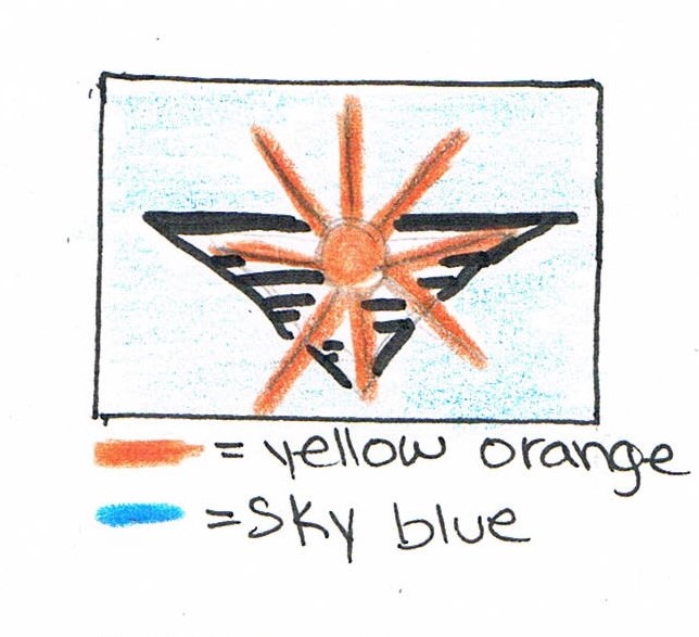
The flag design was inspired by the logos Chermayeff & Geismar & Haviv. Their simplicity of their designs catch everyone's eyes since they're one of the most famous logo designers. Since they were the most hired logo artists that changed the way we see current programs, I wanted to create something similar to the variety of logos they create. By taking a closer look at their logos, it gave me the idea to create something as simple but at the same time meaningful, unlike our current hectic Milwaukee flag . I explored the main attractions of Milwaukee, and Milwaukee's history in order to find out what symbols I might put in my flag. Through my research I learned about Milwaukee's industrial era, but in these current days industry isn't as common as in the 19th-20th century. The great bodies of water like Lake Michigan was a significant part of Milwaukee's culture.
|
|


Meaning of the Piece
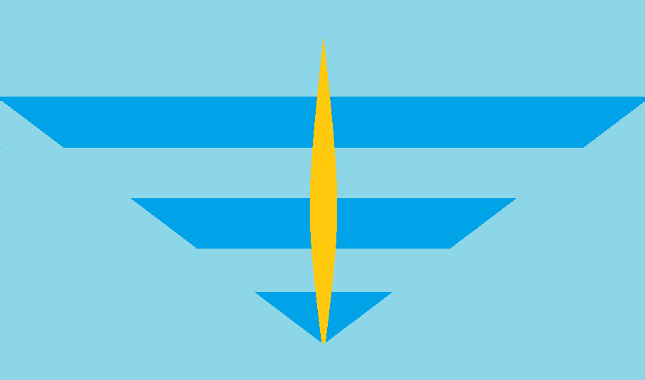
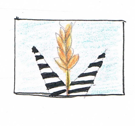
In the start of the project I wanted to create a flag that had barley (plant used to make beer), but it was too overused. In the end I chose to create a flag that contained the three main rivers of Milwaukee which are Kinnickinnic , Menominee, and Milwaukee river along with Lake Michigan. These rivers are an important part of Milwaukee's history since they were used for commerce. This however, polluted the rivers which cause it to stink . Not only do these lines represent the rivers, but it creates the image of Milwaukee Art Museum. The yellow lines represent the color of the barley, which is used for beer and what made Milwaukee most known for that. These lines also create a portal that leads the traveler to a new world of different cultures because Milwaukee is also known for its wide variety of cultures and races, but it was mainly composed of Germans.
Useful Websites
- http://www.milwaukeehistory.net/education/milwaukee-timeline/
- https://3rivers.wordpress.com/2009/09/24/milwaukees-three-rivers/
Process |
Sketches |
|
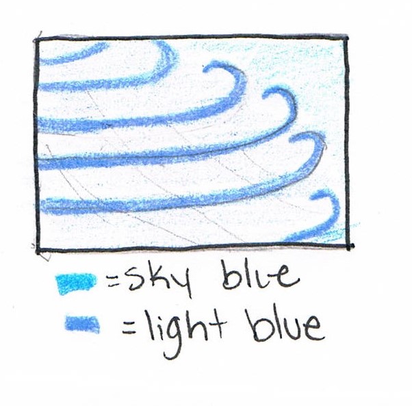
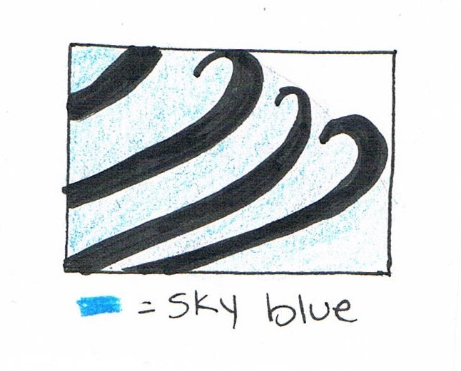
At the beginning, it was unclear to me as to what I wanted to include in my flag design, so I did a checklist of the steps that needed to be taken.
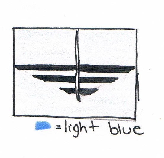
I then took my sketch and started to create my design in Paint, since I didn't have time to complete my flag in school in Photoshop CS6 and I don't have the program either. I first filled the background with light blue. Then I grabbed the line tool, and began to draw three lines with a much darker blue. I also erased the lines in a diagonal way in order to make that pointy end. After this, I added semi curved lines that joined together in the middle in order to create the "portal". The outlines of the lines were then colored with yellow. Finally, my piece was done. |
|

Reflection
In my opinion, I think that my design could need a little more work since it was a bit rushed when creating the final piece. This project had successes such as the message I tried to convey and how it looks in the eyes of the audience. I've succeeded in the simplicity and to prove it I told one of my relatives to try to draw my design. This resulted them in drawing it with ease. However, I had failures as well because I tried to include more to this design, but nothing came up and to me, it is really simple, but apart from that I am satisfied with my hard work.
